News
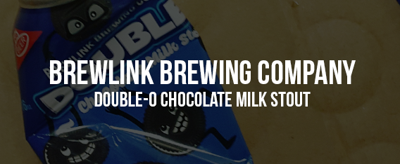
Double-O Chocolate Milk Stout Can Design
BrewLink Brewing Company recently released their Double-O Chocolate Milk Stout beer in a can that I designed! This one was a lot of fun to design. A beer with cookies in it is pretty unique and it deserved the same treatment for the design. Parodying the famous chocolate sandwich cookie was the clear design choice. Paying respect and homage while also poking some fun! The cookie characters were designed to look crazy and out of control. As is a packet of cookies had torn out of their wrapper and jumped head first into this yummy stout.
Working on these cans is a pleasure and each one gets it’s own little narrative. What’s the point in making up characters if they have no story? This beer was available in a limited edition run and sold out in 3 hours. The owners put some of that down to my can design skills. I’ll take that credit but the beer is pretty delicious too! Stay tuned for more from myself and the BrewLink squad!
View Full Post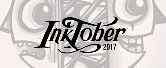
Inktober 2017
31 Days, 31 Inkings
Every October, artists all over the world take on the Inktober drawing challenge by doing one ink drawing a day the entire month. Jake Parker created Inktober in 2009 as a challenge to improve his inking skills and develop positive drawing habits. It has since grown into a worldwide endeavor with thousands of artists taking on the challenge every year.
This year I finally decided to take on the challenge. It was tough but I did it, only falling behind for one day. The challenge of drawing something unique each day is not easy but it’s a wildly creative journey. One I thoroughly enjoyed. I’ve always liked to draw just because, not because I am getting paid or because someone asked me to, just because. I have found some of my best work has come out of those times. This challenge created 31 pieces of art, I don’t like them all but the ones I do like I really like. The time pressure is intense and that can create really great stuff. It can also make you forgive many errors and faults just to get it done before the sunsets.
They were well received too. I’ve been offered cash for individual pieces and two people have asked to buy the entire sketchbook! So a challenge that was inspired out of being creative for no end reason, has turned into a popular set of art spurring new commissions and interest. Funny how doing something you like can give you that result. If you haven’t tried a challenge like this, I highly recommend it. The images featured here are 6 of the 31 inkings. To see the full set, take a gander at my instagram account HERE.
View Full Post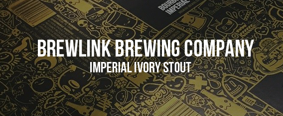
Imperial Ivory Stout Bottle Design
A Favorite Stout Gets a Facelift!
Working with BrewLink Brewing has been a whirlwind of success, with many designs being requested and hitting the shelves in remarkable timelines. This has been a lot of fun for me. With plenty of creative freedom and cool beer names to design from the work doesn’t seem that “worky” at all. With this roller coaster of a journey I am happy to report that the beer I’m designing for is pretty darn amazing! So much so that demand often outweighs supply.
From this peak of success came the idea to take the most popular beer to date and mix it up just a touch. The white stout has always been a fan favorite and having tasted it, I can see why. For the anniversary of the brewery the guys decided to release a special limited edition white stout. ‘Bourbon Barrel Aged Imperial White stout’ was born and everyone was pretty excited about it. This time round the design got some fancy treatment in the form of a bottle and metallic gold label.
I was pretty nervous to see how this one would come out, being the first bottle. I’d always envisaged that one day my doodles would cover a beer bottle. The metallic ink was a stroke of genius and the whole thing came out very cool. Now to get my hands on a bottle to sample…..
View Full Post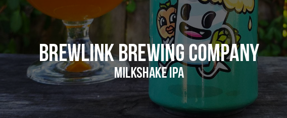
Milkshake I.P.A Can Design
Pretty Pretty Awkward, Pretty Pretty Can
Milkshake and craft beer. That’s right, milkshake and a tasty I.P.A beer. BrewLink Brewery are not scared to try new things and inventing beer oddities is kind of their thing. So when they asked me to design their latest can I was happy to oblige. This beer goes by the name ‘Pretty, Pretty Awkward, Milkshake Indian Pale Ale’ which is exactly what it sounds like. The beer contains hints of peach and mango as well as a sniff of vanilla and fructose which gives it a unique taste.
For the can I wanted to go cheeky and playful. I also wanted to play off the Milkshake vibe of the 50’s. I took inspiration from the ‘Let’s all go to the lobby’ campaign of movie concession stands and twisted it up. The milkshake is running away with the peach while the chubby mango gleefully follows. It was a funny image in my head and it translated pretty well onto the packaging. To date this is probably my favorite can for the brewery. Judging by the early success of the beer it looks like the fans are loving it too. Job done.
View Full Post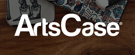
ArtsCases x wotto
Art Cases now available from a new partner!
I recently joined forces with the phone case manufacturer Artscase to make more of my designs available. They have a large selection of my art available in all phone case sizes. As with all of my recommended vendors I asked for samples before featuring them on my site and social channels. They sent me a package containing the three cases shown here in the photo.
All three cases are very well printed with vibrant colors and smooth application. The colors also match the artwork very closely, which in my experience is the main issue when printing cases. The thing I like most about their cases is how thin and snug fitting they are. Although thin they are also very tough. I twisted one pretty hard and it bounced right back into shape. Many other phone cases I have owned or seen tend to snap under such poor handling. Bravo Artscases. If you are in the market for a new case for your phone or devise you should check them out.
View Full Post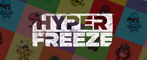
HyperFreeze Rebranding 2017
10 years on, Chillzone becomes HyperFreeze
10 years ago Cumberland Farms commissioned me to develop 12 character designs to represent their iced beverage line ‘Chillzone’. The characters I developed went on to be a roaring success with many spin off products. Icecream, candy, soda drink line, hats, t-shirts, toys, keychains, tattoos and even 6 foot costumes were developed from my designs. The characters had also blossomed into 15 as new flavors were added. In 2017 it was time to rebrand, refresh and rethink the characters. I was honored to get the chance to rework my original designs.
10 years is a long time, in that time my illustration skills have improved and my style has altered slightly. Looking back at the characters I could see how they had dated and were definitely ready for a rework. 15 characters were reduced to 12. Each reworked to give it more character and energy. After months of work and a handful of revisions the characters where approved and ready. Recently the designs were unveiled in stores and are set for many more adventures. For me this is what good client relationships are all about. The Cumberland Farms came back to me after 10 years and trusted me with their brand once more. That means a lot and reaffirms my belief that being a good artist is only part of the job, you have to be good to your clients too.
View Full Post