Blog
Hello. Welcome to my blog. This is where I post new projects and talk a little bit about my experiences with clients. If you are interested in any kind of commission please head over to the contact page.
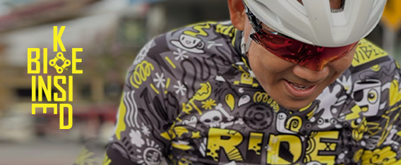
Bike Inside x wotto
Bike Inside is an Italian company specializing in cycle wear. They boast a range of bold and unique designs from artists all over the world. When I was asked to contribute a design to their collection I was thrilled. The design encompassed many elements and played well into my doodle style. With items relating to cycling, creatures, words and icons the shirt really was packed with details. The color scheme was limited but also bold with pops of yellow against a tonal gray. The shirt was am lot of fun to work on and the final result was very cool to see. With followers all over the world this jersey is sure to pop up in many expected and unexpected places. The design is available here.
View Full Post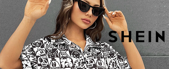
Shein x wotto 2023
I’ve been working with the fashion house Shein since late 2021. As part of their artist series I was asked to add more designs to my collection. Many items sold out fast after launch and that has driven a slew of new products for 2023. I have been featured on socks, key chains, phone cases, dresses, shirts , jewelry and house hold items too.
Throughout last year new items have been added and in early 2023 a slew of further products from the same art have also been created. This partnership has taken my art to a whole new audience and they have featured my work regularly to support me. With lots of new art being approved recently you can expect an even larger assortment or products from me, check in here regularly or follow my instagram for updates. Act fast, they sell out pretty quickly.
View Full Post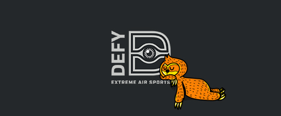
Defy 2023 Campaign
Defy Extreme Air Sports Parks and Fluid Studios asked me to illustrate three detailed illustrations for their 2023 campaign. The campaign centered around getting children off screens and into activities. Catering to adults and kids, their parks are stretched out across the USA with 61 locations! They offer a range of attractions from Trampolines, Battle beams, extreme dodge ball, basketball, air tracks, kid specific jump areas, Ninja courses, parkour courses, stunt falls, trapeze and aerial silks, wall tramp and zip lines! The illustrations were placed over existing photography to create a funny and unique approach to attract customers into the parks. I created three detailed doodle style illustrations and three hand drawn lettering pieces to go with them.
Defy extended the campaign to their sister companies Rockin’ Jump and Sky Zone too. The campaign consisted of emails, digital ads, banner ads, animated gifs, homepage banners and social media assets. The final art work can be seen here. It was great to work with this team again. I worked on another campaign in the previous year, it’s always nice to be asked back!
View Full Post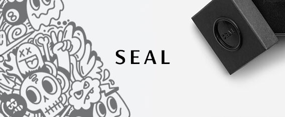
Seal x wotto Doodle Ring
Seal Jewelry based in Norway, let me run wild with one of their rings. Filling such a small space was challenging but super fun. Their rings are hand crafted and laser etched for precision. I really didn’t know if they could achieve the level of detail in the art but the final product came out amazing. Seal gave me a lot of creative freedom and I’m super appreciative of this opportunity. They also did a short interview which was also a great experience. You can read the interview here and purchase the ring here.
View Full Post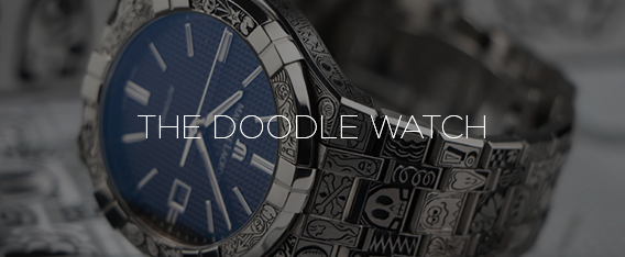
The Doodle Watch
What an incredible project. Through Instagram I was introduced to Time Engraver, a watch craftsman who makes one of a kind engraved watches and jewelry. Time Engraver took a Maurice LaCroix watch and hand engraved the entire thing with my doodles. The level of detail and painstaking work this took blows my mind. It is a one of a kind piece that was truly a labor of love. I am both flattered and humbled that Time Engraver wanted to embark on this project with my art. The final piece is nothing short of incredible. A truly unique piece. Click to see more photos of the incredible details. I doodled the hell out of every millimeter of this thing. An amazing opportunity and a truly amazing final product.
Design – @wotto76
Engraving – @timeengraver
Photography – @t_dani_photography
Watch – Maurice LaCriox
Drop Clothing Collaboration
Drop Clothing are a street wear brand hailing from the North of the UK. They reached out to do a collaboration. Their attitude and creative energy instantly drew me to work with them. I was given an open canvas and an opportunity to do some fun street wear related art. I created three key pieces of art that could be printed on different garments and accessories. Drop requested my signature doodle style in limited color. I created smooth vector lines and a logo lock up for the collection. The designs were printed on tees, sweaters, bags, hoodies and some limited edition shoes. The final product had some very nice detailing and they even printed a pizza style delivery box to send the items out to customers. Custom boxes, free buttons and a beautifully executed product made this collaboration really great. You can see the collection here.
View Full Post