Packaging
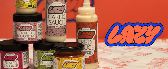
Lazy Kebab Branding Illustration
This project was one of my favorites this year. I worked with Pjadad Agency to develop a set of characters and icons for the brand Lazy Kebab from Sweden . I love the packaging and overall aesthetic of this brand. The art was used across all packaging, apparel, vehicles, in store signage and website. A very nice use of my work.
I’m proud of this work and I am super grateful for the opportunity. Thanks Pjadad Agency and Lazy Kebab Thanks to Sofdforty for working to make this brand come alive, great job on the website!
View Full Post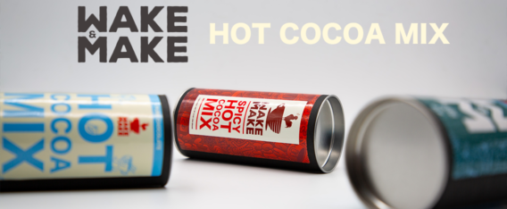
Wake + Make Cocoa Packaging
Earlier this year I designed some coffee bags for Philip DeFranco’s brand Wake and Make Coffee. After the success of the launch, the brand wanted to extend their offerings. With the holidays fast approaching, they asked me to design three Cocoa packages. The flavors consisted of Milk Chocolate, Spicy Hot and Peppermint Cocoa. These flavors influenced the final designs, with each container having a unique front and back design. Available for purchase here.
View Full Post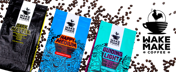
Wake & Make Coffee Packaging
Philip DeFranco asked me to work with him on a brand new coffee company earlier this year. Wake and Make was created to offer quality coffee in small batches as individual purchases or a monthly subscription service. Phil needed three designs to span the light, medium and dark roast coffees and each one had to have it’s own personality.
Each coffee already had a great name so for the me the design came very naturally. The doodle illustration I am recognized for made up the consistent look for the product. Use of color and typography allow me to make each bag look individual while also remaining part of a set. Phil was great to work with, giving me lots of creative freedom. I am really happy with the final bags, I received samples and the coffee is also delicious! If you’re a coffee lover, check them out.
View Full Post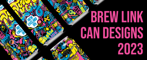
BREW LINK BREWING CAN DESIGNS 2023
Brew Link Brewing Company is an established brewery in the Indianapolis area. I’ve worked with Brew Link to design their packaging and branding for almost 10 years. This year Brew Link grew larger and made more beers. Over the past 12 – 18 months they have released many new beers and I have designed cans for several new ones. Here are the details:
1. BLB Blonde Ale & Strawberry Blonde Ale.
2. Edin-bruh Scotch Ale.
3. Alien Hot Tub grapefruit IPA.
4. Smile Lines – Russian Imperial Stout & Smile Lines – Russian Imperial Stout – Bourbon Barrel Aged.
5. Basically Bitchin’ Pumpkin Ale.
6. Juicy Lucy New England IPA.
7. Margawheata Margarita Style Wheat Ale.
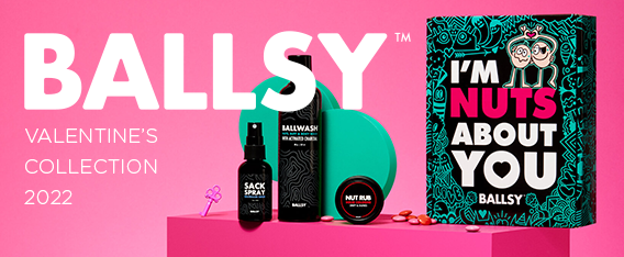
Ballsy Valentine’s Day Branding 2022
I recently learned from the founder of Ballsy that the original product I design packaging for had now hit into the hundreds of thousands of sales. This blew my mind. The art I created is out there in many, many homes all over the world. More importantly, the instructional art I created is hopefully encouraging men everywhere to check themselves out for signs of testicular cancer. After all that is why I was so drawn to the project. To help raise money for testicular cancer awareness. With a percentage of each of those bottles going to charity the sales report was very good to hear. That all started back in 2020. Two years later I have designed a larger Holiday collection and a Valentine’s collection last year. For this year they invited me back. Yay!
The art direction was focused on the original bottle I design but this time applying it to a box. The doodle I created was enormous. Extremely detailed and had an over arching theme of love. It showcases a lot of characters. Mostly couples flirting, kissing and falling in love. It’s a jumble of hidden elements and fun discoveries. It’s the largest vector repeat pattern I have created to date. It was also used to create boxer shorts and socks. The final product looks great and as always, Ballsy took a lot of beautiful product shots. You can see all of the work I have created for Ballsy here and you can pick up the items here at their website.
View Full Post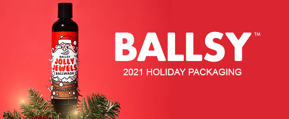
Ballsy Christmas 2021 Packaging
In 2020 I was asked to design some packaging for Ballsy. A men’s hygiene company with a focus on raising awareness of testicular cancer. I created some packaging for their Christmas campaign and also their Valentine’s campaign. This year I was asked to return and design some more pieces for the 2021 campaign. It’s always awesome to be invited back to work on more items for a client. It usually means you did the job well the first time.
For 2021 I updated the ‘Jolly Jewels’ ballwash bottle packaging, the ‘Keep Your Balls Jolly’ gift box and the ‘Deck the Balls’ ball rub gift box. All of these products were available through the holiday season and featured heavily online and social media. The packaging continues the look and feel we established in 2020. It’s always great to work for a company with a positive message and a clear direction.
You can see the Ballwash Campaigns here.
View Full Post