Branding
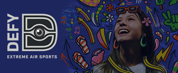
Defy Extreme Air Sports Park
Defy Extreme Air Sports Parks are extreme indoor adventure areas that offer a wealth of exciting one-of-a-kind attractions designed to push your limits, allow you to fly higher and just have tons and tons of fun. Catering to adults and kids, these parks are stretched out across the USA with 61 locations! They offer a range of attractions from Trampolines, Battle beams, extreme dodge ball, basketball, air tracks, kid specific jump areas, Ninja courses, parkour courses, stunt falls, trapeze and aerial silks, wall tramp and zip lines! Having visited one of the parks I can attest to how energy packed and fun they are.
Working with Fluid Studio, an agency out of Utah I created a range of illustrations and a logo to support the 2022 Summer “Play-cation” Pass marketing campaign. The illustrations were created to work alongside existing promotional photography for the park. Characters, elements and words were illustrated to demonstrate the high energy experience of the park. These illustrations were used for social media, emails, the Defy website, advertising, animated spots and in-store posters. I also created a set of stickers from the many characters I designed fro this project. This was a great project that matched my art style very well. Both Defy and Fluid Studio were a pleasure to work with.
View Full Post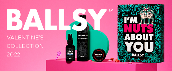
Ballsy Valentine’s Day Branding 2022
I recently learned from the founder of Ballsy that the original product I design packaging for had now hit into the hundreds of thousands of sales. This blew my mind. The art I created is out there in many, many homes all over the world. More importantly, the instructional art I created is hopefully encouraging men everywhere to check themselves out for signs of testicular cancer. After all that is why I was so drawn to the project. To help raise money for testicular cancer awareness. With a percentage of each of those bottles going to charity the sales report was very good to hear. That all started back in 2020. Two years later I have designed a larger Holiday collection and a Valentine’s collection last year. For this year they invited me back. Yay!
The art direction was focused on the original bottle I design but this time applying it to a box. The doodle I created was enormous. Extremely detailed and had an over arching theme of love. It showcases a lot of characters. Mostly couples flirting, kissing and falling in love. It’s a jumble of hidden elements and fun discoveries. It’s the largest vector repeat pattern I have created to date. It was also used to create boxer shorts and socks. The final product looks great and as always, Ballsy took a lot of beautiful product shots. You can see all of the work I have created for Ballsy here and you can pick up the items here at their website.
View Full Post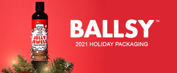
Ballsy Christmas 2021 Packaging
In 2020 I was asked to design some packaging for Ballsy. A men’s hygiene company with a focus on raising awareness of testicular cancer. I created some packaging for their Christmas campaign and also their Valentine’s campaign. This year I was asked to return and design some more pieces for the 2021 campaign. It’s always awesome to be invited back to work on more items for a client. It usually means you did the job well the first time.
For 2021 I updated the ‘Jolly Jewels’ ballwash bottle packaging, the ‘Keep Your Balls Jolly’ gift box and the ‘Deck the Balls’ ball rub gift box. All of these products were available through the holiday season and featured heavily online and social media. The packaging continues the look and feel we established in 2020. It’s always great to work for a company with a positive message and a clear direction.
You can see the Ballwash Campaigns here.
View Full Post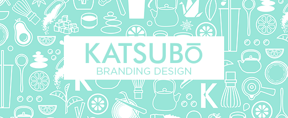
Katsubō Branding
Katsubō hand crafted tea is a new brand based out of Orange County California. I was asked to work with them to develop a logo and branding for packaging, retail space, uniforms and products. The logo went through many iterations but the client decided on a Samurai as it reflects the service part of their business. On every Katsubō cup you will find the face of a Samurai. The word samurai comes from the Japanese verb saburau, which means “to serve”. The typography needed to be clean and fresh with the ability to run vertically and horizontally for product application.
Packaging is the largest part of the brand because the cups, bags, foil seals and boxes are all very client facing. These items are what are taken away from the retail space. The cups also had to be mostly transparent so the beautiful drinks could be seen. The tea is really the show stopper for this brand. Sourcing only the finest Premium teas, using only the freshest ingredients and supporting organic farmers Katsubō’s teas are very special. The tea is a multi-cultural new-age fusion beverage that takes influences from: Japan, China, Taiwan, Vietnam, Belgium, France, Korea and Italy. I have tried many and they are all unique and delicious.
The items designed included Logos, cups, lids, cup sleeves, bags, cup carriers, stencil, staff t-shirts, aprons, masks, drink holder, gift cards, Taiyaki box, store signage, window decals and marketing graphics for social media. A lot of the packaging utilized a pattern I created with many icons and images related to the brand. When the design was complete and the stores opened the branding worked very well together for a consistent customer experience. This project was a good change of skill sets for me. So often I am employed to do similar things but on this occasion I got to work on something very simple, yet had to tick many boxes. They have stores in Mission Viejo and Fullerton, CA. I really enjoyed this one and having tasted the products I think Katsubō is poised for a lot of growth. You can see more of the work here.
View Full Post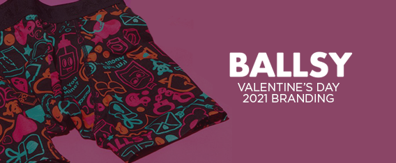
Ballsy Valentine’s Day Branding
Building on the success of my work with Ballsy for a limited edition line and a holiday line, I was asked to design some branding for the valentine’s collection. The collection consisted of a new Valentine’s body wash, a gift box set, boxer shorts, and socks. A pattern was created in keeping with my past branding, as well as a new cupid character. As always, Ballsy was an awesome brand to work with. They also took great photography and marketed the product really well. It’s always great to see my art on product but when brands present it so well it makes it all the better.
View Full Post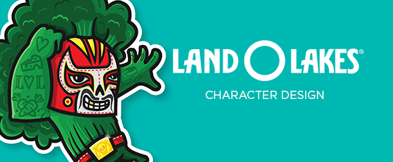
Land O’ Lakes Character Design
Land O’ Lakes approached me in early 2019 to work on a project for their Food Service division. Land O’ Lakes supplies dairy products to retail, kitchens and schools. I was asked to create a set of characters to encourage young people to make healthier choices when eating at school. I created 5 characters based on popular products that are made available to schools from Land O’ Lakes. Cheese, vegetables, fruit milk and mac n’ cheese were the products I was given to create characters.
The final characters were a broccoli Lucha Libre, a mac n’ cheese super hero, a cow professor , a family of cubed cheese and a dashing strawberry hero. These characters needed to be bright, bold and full of movement. Using the brand’s existing color palette I tried to make each character have an individual story. Launching in 2020, these characters were used to create posters, stickers, trading cards and other promotional items. Schools across America will have these characters adorning their cafeteria walls and kids will trade these cards. Hopefully it will encourage kids to eat better and add a splash of color to their dining experience.
View Full Post