Blog
Hello. Welcome to my blog. This is where I post new projects and talk a little bit about my experiences with clients. If you are interested in any kind of commission please head over to the contact page.
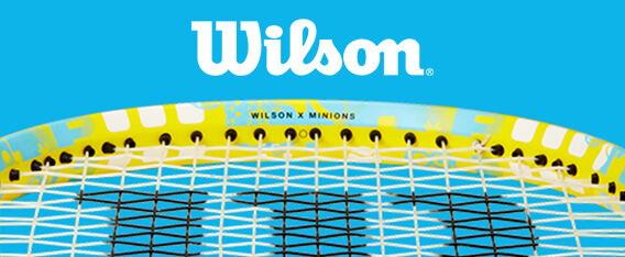
Wilson x Minions Tennis Collection
Wilson are one of the biggest sporting brands in the world. This year I got to work on collaboration between this sporting giant and Illumination Entertainment. The Minions are also an iconic set of characters who have global appeal. Wilson wanted a fresh take on the Minions for their 2022 line. The line included tennis rackets, bags, badminton sets and accessories. I designed several concepts with multiple pieces of art. Two looks were selected.
The first piece of art is a very abstract tiled pattern that is full of Minions, tennis symbols and gradient shapes. The colors are relevant to the Minions but I selected brighter more unique colors. The second look was a repeated emoji style Minion, repeated to look like an audience at a tennis match. Both designs were well received and selected for many pieces of the collection. You can see the full collection here. All product is ©Universal Studios.
View Full Post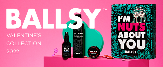
Ballsy Valentine’s Day Branding 2022
I recently learned from the founder of Ballsy that the original product I design packaging for had now hit into the hundreds of thousands of sales. This blew my mind. The art I created is out there in many, many homes all over the world. More importantly, the instructional art I created is hopefully encouraging men everywhere to check themselves out for signs of testicular cancer. After all that is why I was so drawn to the project. To help raise money for testicular cancer awareness. With a percentage of each of those bottles going to charity the sales report was very good to hear. That all started back in 2020. Two years later I have designed a larger Holiday collection and a Valentine’s collection last year. For this year they invited me back. Yay!
The art direction was focused on the original bottle I design but this time applying it to a box. The doodle I created was enormous. Extremely detailed and had an over arching theme of love. It showcases a lot of characters. Mostly couples flirting, kissing and falling in love. It’s a jumble of hidden elements and fun discoveries. It’s the largest vector repeat pattern I have created to date. It was also used to create boxer shorts and socks. The final product looks great and as always, Ballsy took a lot of beautiful product shots. You can see all of the work I have created for Ballsy here and you can pick up the items here at their website.
View Full Post
Shein x wotto Collaboration
In late 2021 I was asked to partner with the global fashion brand Shein. As part of their artist series I was asked to provide art to be made into products. These products were made available through their website. shein.com Throughout the year new items will be added. This was an exciting opportunity and together we worked on eight products for release in 2022. At the time of writing this five of the eight products have been released. Having a collection with a global brand is an interesting experience. The reach and relevance of this brand means my art will touch a whole new audience across the globe. That in itself was pretty attractive to me but they also paid me too, which is nice.
View Full Post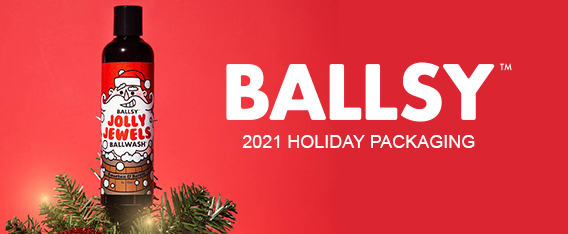
Ballsy Christmas 2021 Packaging
In 2020 I was asked to design some packaging for Ballsy. A men’s hygiene company with a focus on raising awareness of testicular cancer. I created some packaging for their Christmas campaign and also their Valentine’s campaign. This year I was asked to return and design some more pieces for the 2021 campaign. It’s always awesome to be invited back to work on more items for a client. It usually means you did the job well the first time.
For 2021 I updated the ‘Jolly Jewels’ ballwash bottle packaging, the ‘Keep Your Balls Jolly’ gift box and the ‘Deck the Balls’ ball rub gift box. All of these products were available through the holiday season and featured heavily online and social media. The packaging continues the look and feel we established in 2020. It’s always great to work for a company with a positive message and a clear direction.
You can see the Ballwash Campaigns here.
View Full Post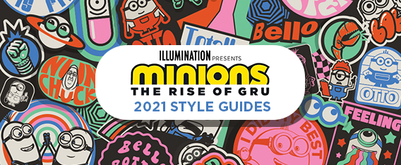
Minions 2 – The Rise of Gru Style Guides 2021
For the upcoming 2022 movie release of Minions 2 : The Rise of Gru I worked on several style guides during 2021. Originally the movie was due to release in the summer of 2020 but has been pushed back several times due to Covid19. Style guides are designed to give manufacturers and product partners worldwide an opportunity to use pre-approved art to create their product. The art in these guides gets used on thousands of products globally.
These guides are relatively new but they were still used substantially around the globe in 2021. You can see all four of the guides here.
Iconic Mayhem 0.2 – Based on the success of the first style guide I designed I was asked to provide a new version. This time I focused on a new color palette and contemporary typography.
Stay Trippy – This guide was born out of a piece of art I created during the development of the movie. It was originally designed as a movie development piece that was then built upon to create a guide. It marries vintage looking cosmic design with tripped out floral seventies minions.
Momo’s Minions – Working with the incredibly talented Momo Wang this design was created to support the halo partnership business. Momo is a very established animator and artist and it was a pleasure to work with her interpretation of the minions characters.
Iconic Mayhem 0.3 – By the end of the year Iconic Mayhem one and two were so well received and used by partners, I was asked to make a third. This one was focused on color and texture as well as the introduction of rendered 3D minions.
I was the creative director on these guides, creating graphics, mood-boards, patterns and icons. The art and production was supported by Lincoln Design Company, Tatiana Krasovski, Momo Wang Adam Highton. Character art support was provided by Sean Millard.
View Full Post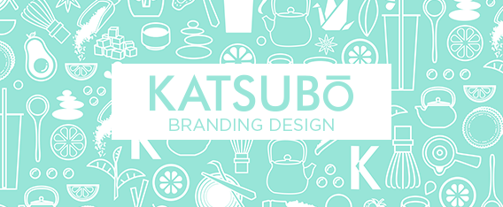
Katsubō Branding
Katsubō hand crafted tea is a new brand based out of Orange County California. I was asked to work with them to develop a logo and branding for packaging, retail space, uniforms and products. The logo went through many iterations but the client decided on a Samurai as it reflects the service part of their business. On every Katsubō cup you will find the face of a Samurai. The word samurai comes from the Japanese verb saburau, which means “to serve”. The typography needed to be clean and fresh with the ability to run vertically and horizontally for product application.
Packaging is the largest part of the brand because the cups, bags, foil seals and boxes are all very client facing. These items are what are taken away from the retail space. The cups also had to be mostly transparent so the beautiful drinks could be seen. The tea is really the show stopper for this brand. Sourcing only the finest Premium teas, using only the freshest ingredients and supporting organic farmers Katsubō’s teas are very special. The tea is a multi-cultural new-age fusion beverage that takes influences from: Japan, China, Taiwan, Vietnam, Belgium, France, Korea and Italy. I have tried many and they are all unique and delicious.
The items designed included Logos, cups, lids, cup sleeves, bags, cup carriers, stencil, staff t-shirts, aprons, masks, drink holder, gift cards, Taiyaki box, store signage, window decals and marketing graphics for social media. A lot of the packaging utilized a pattern I created with many icons and images related to the brand. When the design was complete and the stores opened the branding worked very well together for a consistent customer experience. This project was a good change of skill sets for me. So often I am employed to do similar things but on this occasion I got to work on something very simple, yet had to tick many boxes. They have stores in Mission Viejo and Fullerton, CA. I really enjoyed this one and having tasted the products I think Katsubō is poised for a lot of growth. You can see more of the work here.
View Full Post